
Sunday, November 30, 2014
Saturday, November 22, 2014
Emma Watson; He For She

Think
about these words, airmen, stewardess, nurse and hairdresser. Did you
automatically put one gender to these words? This is considered feminist. Feminism
can be a very controversial word, although recently, the famously known Emma
Watson is redefining it. She, being the United Nations Women Goodwill
Ambassador, on the 20th of September gave an extremely convincing
argument on how feminism is seen. She has been promoting men to support women’s
equality. Yet most importantly, Emma stands for the acceptance of feminism in
her rediscovered meaning of the word in her statement, “The belief that men and
women should have equal rights and opportunities. It is the theory of the
political, economic and social equality of the sexes.”
There
has been much controversy on the movement Emma started, and it is how companies
or organizations go about promoting such a purely genuine movement without polluting
the true meaning that creates such a controversy.
Corporations
either loathe it or love it. Time
magazine promoted an article written by Cathy Young, a Reason magazine editor, stated, “Until feminism recognizes
discrimination against men, the movement for gender equality will be
incomplete.” She believes Emma, “Says nothing about problems affecting men and
boys.” When Emma explicitly states in her speech, “When at 18 my male friends
were unable to express their feelings.” The statement was proved null and void
within Emma’s speech and when Elle
magazine decided to manufacture t-shirts that say, “This is what a feminist
looks like.”
A
writer of an online news source, Tansy Hoskins, wrote an article about Elle’s t-shirts based on Emma’s
movement, called, “The Feminist T-shirt scandal exposes an entire system of
exploitation.” The article expands on how Elle is, “Using feminism for
consumerism”, and how they should be worried about women working in a sweatshop
making these shirts for 62 pence an hour in Mauritius, a small island near
Madagascar.
Writer
for People magazine, Tim Nudd, is in favor of Emma’s speech. He names a list of
famous men on twitter who promote Emma’s movement #HeForShe. One of the men
listed is Joseph Gordon Levitt, famously known for many acting roles, such as a
Gotham cop named Blake in “The Dark Knight Rises”. He tweets “Join the conversation RE: #Feminism for our TV show. I consider myself a
Feminist - what about you? WATCH: http://bit.ly/1si2FWB” and
attaches a link for a show he created called HitRecord, which is a series of videos submitted by viewers
answering a question, idea, or topic presented by Joseph. In this tweet, he
asks his viewers to talk about their idea of feminism, good or bad. He explains
that he is a feminist, because his mother, who was involved in the second
feminist movement, suffrage being the first, explained that feminism is when
one believes that men and women should be treated equally, and that being the
opposite sex shouldn’t limit ones experiences, opportunities, or pay salary. This
example of Emma’s He for She support is in favor of her campaign because it is a
genuine message of encouragement and opinion.
Sunday, November 16, 2014
Shutter Island
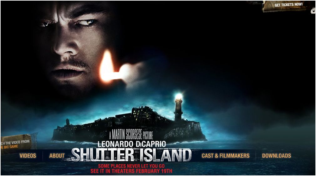
Martin Scorsese directs a
psychological thriller, and in the suspenseful motion picture, Leonardo
DiCaprio plays the main character, Teddy Daniels or Marshall. Upon arrival to
the famous Ashecliffe, a renowned high security prison for the criminally
insane. Daniels is introduced to his new partner, Chuck Aule, cleverly played
by Mark Ruffalo. They embark on a quest to uncover the mystery of a missing
patient, Rachel Solando. As the two detectives work with Dr.Cawly, played by Ben Kingsley, who is the owner of
Ashecliffe to find clues, Daniels finds himself questioning authority. He also
becomes increasingly leery of his surroundings. As flashbacks become more
frequent, he struggles to hold onto what is true when lines between the sane
and insane are blurred. The film brilliantly portrays scenes in sophisticated
ways with many underlying meanings.
What hooks the
audience initially are the minute abnormalities that are first presented. Such
as the strikingly uncoordinated tie that Teddy Daniels wears within the first
scene. It provokes the question, “What would make a man wear such an ugly tie?”
It automatically persuades the audience to pay close attention to other similar
cues, seen and unseen, that are out of place. As these clues build upon themselves,
it slowly reveals the essential theme of the story.
The musical score
adds suspense, sophistication and a hint of lunacy. All of these elements add
to the description of Daniels character and the moment of the scene. It is
excitingly contradicting when opera music plays during one of Daniels military
flashbacks. A soothing opera score becomes a chill of goose bumps. It perfectly
personifies the scene to take the audience out of their comfort zone and
experience Daniels split sanity between reality and imaginary.
All throughout the
film, the theme of betrayal becomes closer involved with isolation. Characters
around Daniel who initially could never have been seen as trustworthy become
Daniel’s source of truth, and visa versa. Unexpected turns in these changing
relationships lead the audience into multiple unforeseen plot twists.
Overall, this film
is a memorable psychological thriller of its time. It never leaves the viewer
in a dull moment. Every second contains details so curtail, it is almost
necessary to watch twice to catch them. And the end, left to the audience to
determine which end of the spectrum reveals its true meaning, Daniels tells his
partner, “Would you rather live the rest of your life a monster, or die a good
man?”
Sunday, November 9, 2014
Kings and Queens of the Court
At Bridgewater
Sate University’s Tinsly Gymnasium, it was a close call when one intramural volleyball team in particular almost thought they wouldn’t make it to the next
round, until they rallied their points back in the last few minutes and won the
game.
“Before
the game started I could see that the freshman volleyball team was intimidated
by the upperclassmen team.” Reports the referee. When asked why he thought so,
he adds, “It was obvious when the freshmen team were more huddled together and
strategizing, while the upper classmen team were peppering the ball and warming
up.”
Team Captain of
the winning freshman volleyball team, Jamie, reports, “After we missed our
first couple of serves, you could see the tension and our nerves getting to
us.”
The
opposing team’s middle hitter added, “Because we were given the ball so many
times, we could afford a few mistakes and still recover. We had a good momentum
going.”
The
freshmen team stated that it didn’t turn around until the score was 16 for
freshmen and 19 for the upperclassmen. “That’s when Kaley, being as awesome as
she is, aced three of her serves” says Emily, the outside hitter for the
freshmen team. “From then on we didn’t let the other team score again”
“The
second game against the upperclassmen was different.” Jamie tells the reporter.
“We knew we had our A game going, and nothing could stop us. We worked so hard
in the second game, but it was so worth it!”
Zac,
the middle hitter on the freshmen team, added, “It’s as if someone flipped a
switch, and the upperclassmen weren’t ruling the court anymore.”
“We’ve
got a tough team. When we know it’s getting rough out there, we try to get the
spirits up and help each other out if we miss a serve or a volley.” Then Jamie
adds, “Most importantly, we’ve got each other’s backs, and we don’t point fingers
when the score is down.”

Sunday, November 2, 2014
Typography, it's Important!
As
you’re reading this sentence right now, every word and letter is an example of
typography. Typography is not a commonly known term. It essentially is the
style and appearance of print, which includes arranging type in certain
esthetically pleasing ways.
What’s so important about
typography? Font types and letter structures do not strike readers before the
content of the actual text normally, which is its purpose. “If you remember the shape of your spoon at
lunch, it has to be the wrong shape. The spoon and the letter are tools; one to
take food from the bowl, the other to take information off the page…when it is
a good design, the reader has to feel comfortable because the letter is both
banal and beautiful.” Explains Typographer,
Adrian Frutiger.
It
is meant to allow a reader to absorb the text without being distracted by how
it’s written.
Right now, this particular font, with
this particular type style, influences the reader to feel that this writing must be
educational and intriguing. Different types of typography persuade the reader
to feel certain ways about what they are reading. In an experiment done by
Kevin Larson and Rosalin Picard, they proved just that. Out of twenty
participants, they gave half of them poor typography, and the other half good typography. Given twenty minutes to read the passage, one test group
of participants were interrupted fifteen minutes through, and were asked how
long they were reading for. The other test group was interrupted at seventeen
minutes and asked the same question. Participants given good typography thought that they had been reading for an average of twelve minutes, both were interrupted
after fifteen and seventeen minutes. Unlike participants given bad typography, who assumed a longer amount of time had passed while reading their passage.
This experiment proves that the readers with good typography were more engaged
in their text.
It is important to be engaged in the text,
especially where readers spend most of their time being engaged. Computer fonts
are the most common form of typography people encounter. It wasn’t too popular
to have fonts until Steve Jobs created the first Macintosh computer. At Reed
College, he had taken a calligraphy class, one of the best in the country, and
never imagined its beneficial use in the future. He created beautiful
typography for Macintosh fonts and since has made an impact on the elegance of
fonts on computers. “If I had never dropped out, I would have never dropped in
on this calligraphy class, and personal computers might not have the wonderful
typography that they do.” Simply put by Jobs at a commencement speech at
Stanford in 2005.
Subscribe to:
Comments (Atom)